Happy November!
Over the past few months, while I was publishing Amy of the Necromancers (which is now available for free as a full ebook when you sign up to my newsletter!) I’ve been doing a lot of newsletter swaps with other sci-fi and fantasy indie authors. Basically, that means that I will mention their book in my newsletter in exchange for their mentioning my book in theirs. It’s a simple process that allows both writers to reach a lot more readers.
One of my favorite parts of doing these swaps is that I get to see what a bunch of other indie authors are writing! I’ve bought several of their books and subscribed to several of their newsletters to get their reader magnets, and I’m excited to dig into all the indie goodness.
While perusing other authors’ books, I’ve noticed a lot of beautiful covers. I’m a sucker for a good cover, and I know plenty of other people are, too.
That’s why I thought I would share ten of the most beautiful, eye-catching covers from authors I’ve swapped with in the past few months! This is completely subjective, according to my taste, and in no particular order. Please enjoy!
Hope at the end of the world.
Love stronger than magic.
Courage to topple kingdoms.
Adventures that reach new realms.
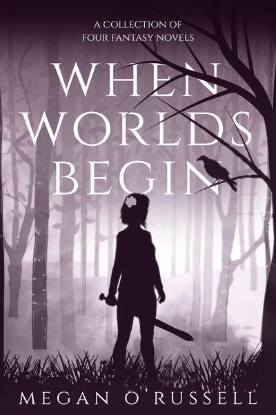
Isn’t this one just hauntingly gorgeous? I love everything about this cover, from the depth of the forest behind the figure, to the way the tree branches weave into the title, to the simplicity of the images. I’ll admit that this cover made me impulsively buy the book before even fully reading the description. Yes, I am shallow. But the description sounds awesome, too!
You can find When Worlds Begin on IndieBound, Kobo, Google Play, and Amazon.
When the gods came calling, she was the only one who answered.
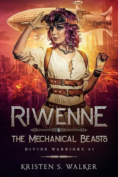
This cover is bad. Ass. I love Riwenne’s hair, I love her pose, I love the zeppelin, I love the way the cover fades to black at the bottom to highlight the text, and most of all, I love that font! There’s a lot of text, but it’s integrated so well into the design of the cover that you barely notice. The steampunk style really comes through in those accents around the “&” and between the title and the author’s name. If you check out the rest of the books in the series, you can also see how they fit together so well—each one is distinct, but it keeps the same layout.
I actually did an interview with Kristen S. Walker, the author of this book, on my blog. You can check it out here.
Find Riwenne & The Mechanical Beasts in Barnes & Noble, Abebooks, Book Depository, IndieBound, and Amazon.
Frigid waters, monstrous leviathans, and seven other heirs lie between her and the crown.
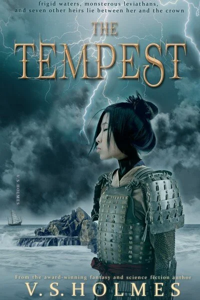
There’s a lot to love about this cover. I love the expression on the character’s face, the detail on her armor, the spiky lettering of the title, that little boat in the far background, and the overall color scheme that makes the yellow letters pop against the blue-gray.
The Tempest is free when you subscribe to V. S. Holmes’ newsletter! Check it out on StoryOrigin.
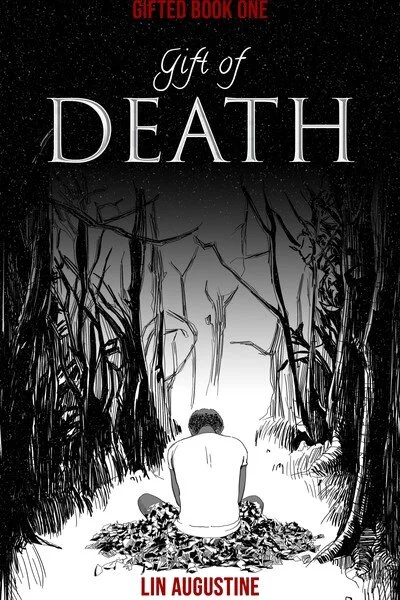
What if you were born with powers that made you dangerous to those you love?
It’s hard to make a black-and-white cover image grab my attention when there are so many colorful covers out there, but this one did just that. I love the art style, reminiscent of a comic book, and the way the red text stands out against both the white at the bottom and the black at the top. The image is so intriguing and full of emotion—you can tell the character’s grief in his posture and the menacing, stressful situation in his jagged surroundings.
You can find Gift of Death on Amazon.
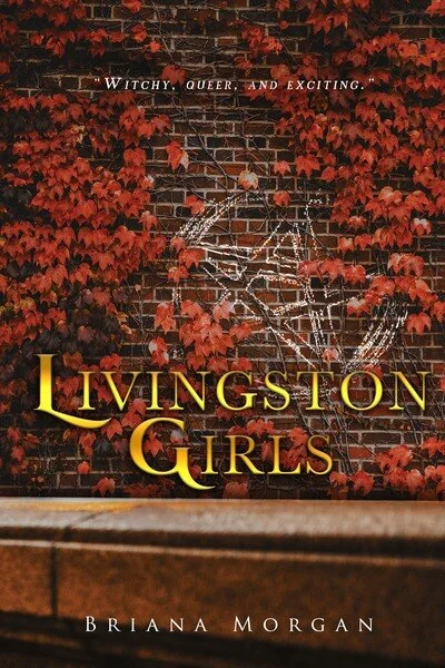
“I see something in you, Miss Abbott, something I recognize. The potential for greatness, for channeling magic. For bending the world to your will.”
This cover might not be as flashy as some of the others in this post, but it’s certainly intriguing. I love the depth created in the image by including the veranda or fence at the bottom of the cover. I love how the chalk symbol is partially obscured by the vines growing on the brick wall. It has an air of mystery that makes me want to find out more. The colors are also gorgeous and eye-catching.
You can find Livingston Girls on Kobo, IndieBound, and Amazon.
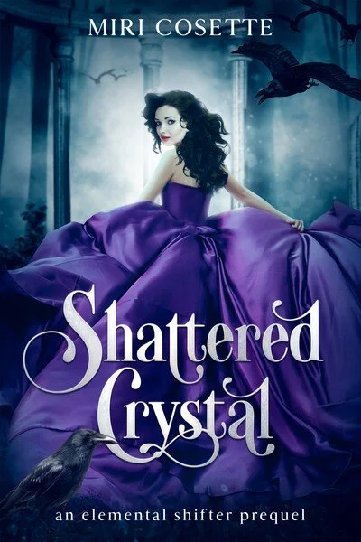
A future of immortality beckons… but at what cost?
Covers featuring women in ball gowns are a dime a dozen, but this one stands out for me. First of all, this ball gown is a gorgeous color, and the shading on it is so dramatic and eye-catching. Second, the gown spreads across the bottom two thirds of the cover, making it feel sumptuous and magical. Third, that background is so ominous! I absolutely love the crow in the bottom left with its beak partially obscuring the text.
You can get Shattered Crystal for free when you subscribe to Miri Cosette’s newsletter!
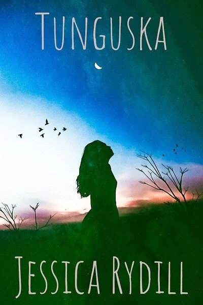
When young shaman Annat Vasilyevich gives birth to her first child, she should be filled with joy. But Oscar is the son of two shamans – a shaman squared.
Like I said before, I’m a big fan of simplicity when it comes to book covers. I also tend to enjoy silhouettes more than full figures—it leaves more to the imagination and contributes to that simplicity. I adore the colors of the sky and how diffuse and pastel they look, not to mention how they make the silhouette of the character, the birds, and the trees stand out. The font is simple and fits the feel of the cover well.
You can get a preview of Tunguska for free when you sign up for Jessica Rydill’s newsletter!
Magic is real, and it is terrifying.
My kingdom used to live in peace and prosperity, but that all ended on the day I was born. The day the drought started.
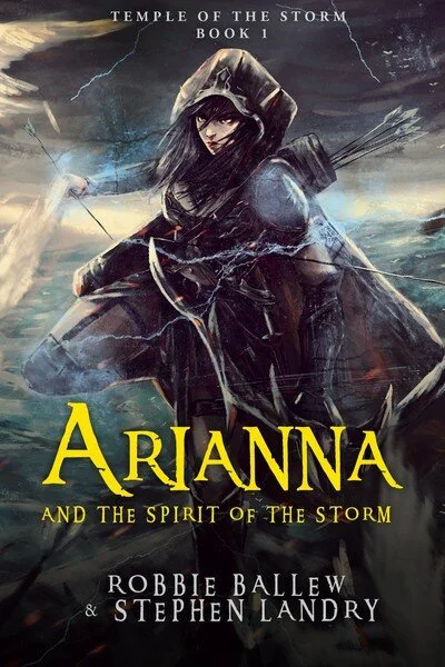
Here’s another badass cover! It’s hard to say what I like best. Is it the art style, the loose brush strokes that suggests movement and urgency? Is it the way the cover almost seems aged, like there are creases in the artwork? Is it the intense expression on the character’s face or her badass pose? Is it how the yellow letters of the title pop so nicely against the dark color palette? I’m also a big fan of the irregularity of the font, which gives it a fun, YA vibe.
You can find Arianna and the Spirit of the Storm on IndieBound or Amazon.
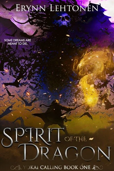
SOME DREAMS ARE MEANT TO DIE.
An engineer craving to become a warrior. A majyu with his future bound in filial piety… and a dark sorcerer who steals women into the night.
Okay, I know I said simple covers are my favorite, and there’s definitely a lot going on here. But I couldn’t resist the gorgeous colors ranging from gold to deep purple to pink, the insubstantial dragon made out of light, the badass pose of the character, the menacing skull in the darkness, and all those creepy winged creatures. There’s so much motion and energy! I also love the shading on the text that makes it seem like it’s a part of all the chaos. Finally, I just have to give a shout-out to that tag-line and its unexpected placement. “Some dreams are meant to die”? That’s badass. I’m in.
You can find Spirit of the Dragon for free on Google Play and Amazon!
They created her to kill gods – and then they left her with the Elves.
Deemed unfit by the very wizards who made her, Zelia’s powers slumber, until she is given an ultimatum. Prove herself. Or perish.
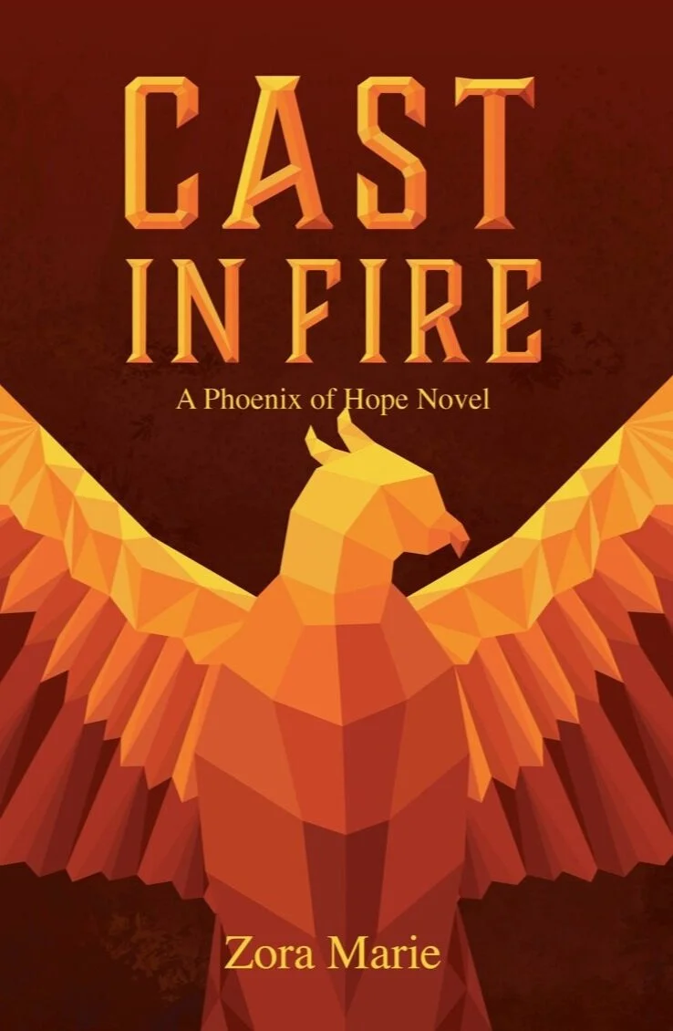
Here’s another beautifully simple cover to wrap up the post. The color is striking, evoking the fire of the title—the background red is so rich and deep, and the gradient draws the eye easily to the center of the image. I love the geometric pattern of the bird, which makes it very distinctive and abstract. Even better, the rest of the book covers in the series fit wonderfully with the first one, maintaining the geometric style but changing the color palette.
One of the coolest things about this cover is that the author, a professional graphic designer, created it herself!
You can find Cast in Fire on IndieBound, Google Play, Kobo, Barnes & Noble, and Amazon.
Which of these covers was your favorite? Did you buy or download any of them on impulse, like I did? Also, I’m always on the lookout for other gorgeous indie book covers, so let me know about any others I should check out.